



01 · OVERVIEW
NeuroKind
A calm, sensory-friendly department
store created for the neurodivergent
community. Everything it stocks
is chosen to support focus,
comfort, and emotional balance.
NeuroKind is built on the belief that calmness
creates clarity. The brand stands for simplicity,
empathy, and inclusion, crafting experiences
that feel pure, balanced, and emotionally
grounding. Every product and space reflects a
sense of quiet confidence, inviting people to
slow down, breathe, and reconnect with
themselves. NeuroKind celebrates the beauty of
different minds and creates an environment
where clarity replaces clutter and calm
becomes a form of strength.
A store that sells calm cannot look loud. I
designed the identity end to end and wrote the
rules that let it grow. Every part of it had the
same job: take noise away, never add it. The line
under the mark says it out loud:
For Minds That Feel.
02 · THE LOGOMARK
A butterfly, built as a system.
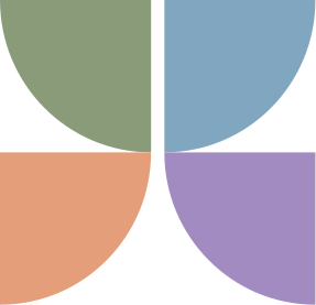
The NeuroKind logo is built from a
simple geometric form repeated four
times in two opposing directions,
creating the shape of a butterfly.
This repetition symbolizes the
unfolding of the human mind and
represents transformation, growth,
and balance within the
neurodivergent community. The
butterfly embodies how every mind
opens and evolves in its
own unique way.

Logo lockups
Primary logo. The main brand mark, for
print, packaging, and digital.
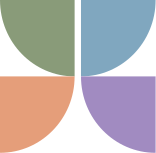
Logo mark. A standalone symbol for
icons, patterns, and social,
best used small.

Secondary logo. For horizontal layouts
and tight spaces: headers and signage.
Adaptations
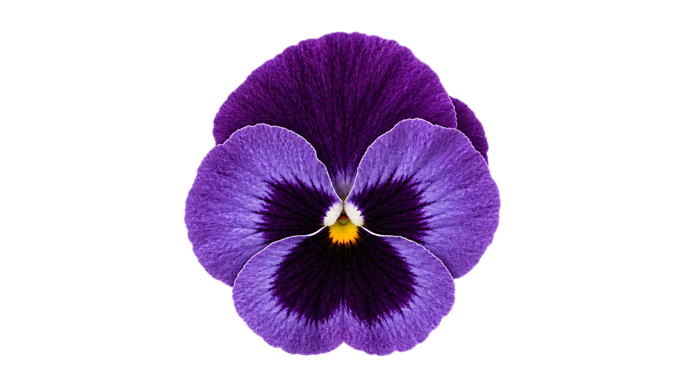
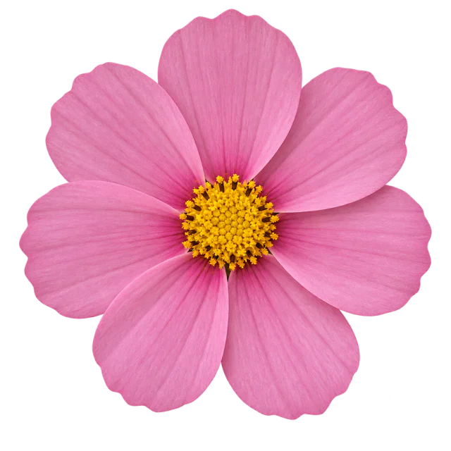
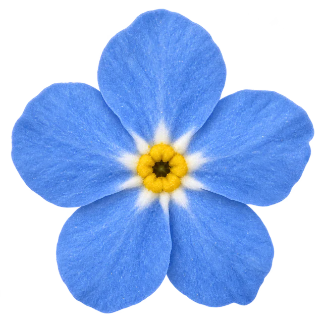
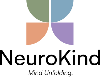
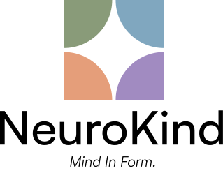
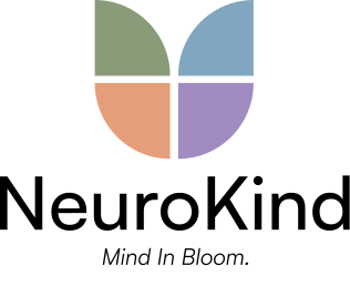
The following adaptations show how the NeuroKind identity can extend to represent different seasons or core values. Mind Unfolding, Mind In Form, and Mind In Bloom each reflect a stage of growth, clarity, and balance. The consistent petal shapes express harmony and inclusivity, while their arrangement symbolizes calm transformation and continuous evolution.
Three adaptations extend the identity:
Mind Unfolding, Mind In Form, and
Mind In Bloom. Each shows a stage of
growth. The same petal shapes keep
them one system.
03 · COLOUR AND TYPE
Four colours,
none of them loud.
The design of NeuroKind embodies
softness, clarity, and inclusivity.
Every element, from materials to
lighting to colour, is carefully chosen
to create a soothing sensory
experience. The palette reflects calm
pastels that evoke peace and
balance. Rounded shapes, open
spacing, and gentle textures mirror
the brand’s empathy and warmth.
Colour palette
Sage Clarity: Represents growth, grounding, and calm
balance; a natural, soothing anchor tone.
Sky Stillness: Evokes openness and gentle
mental refreshment.
Clay Warmth: Brings warmth, comfort, and human
connection to the palette.
Lilac Tranquility: Symbolizes emotional peace,
mindfulness, and creative softness.
Pantone 5565 C
C 39M 19Y 48K 0
R 137G 155B 121
Hex #899b79
Pantone 5435 C
C 47M 26Y 17K 1
R 128G 167B 191
Hex #80a7bf
Pantone 4725 C
C 7M 47Y 52K 0
R 229G 158B 122
Hex #e59e7a
Pantone 7445 C
C 34M 44Y 0K 10
R 161G 139B 193
Hex #a18bc1
Typography
Satoshi Variable is the primary typeface, used across all
brand communications to maintain a modern, balanced,
and approachable look.
Its clean geometry and smooth curves reflect
NeuroKind’s sense of calm clarity.
Satoshi Variable
Light 300 · Regular 400 ·
Medium 500 · Bold 700
0123456789abcdefghijklmnopqrstuvwxyz
Calmness
creates clarity
HEADINGBold 700
48 to 64 px
A quiet space for you
SUBHEADINGMedium 500
32 to 44 px
For Minds That Feel.
TAGLINEItalic
18 to 24 px
Every product and space reflects
a sense of quiet confidence.
BODYRegular 400
14 to 18 px
04 · THE DEPARTMENTS
Three departments,
told apart on sight.
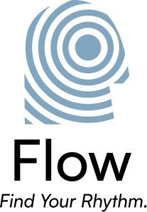
The department icons carry the
NeuroKind identity through soft,
balanced forms drawn from gentle
motion and mindful direction. Each
one holds a single cue for its own
department while staying part of the
same family, so three departments
still read as one brand.
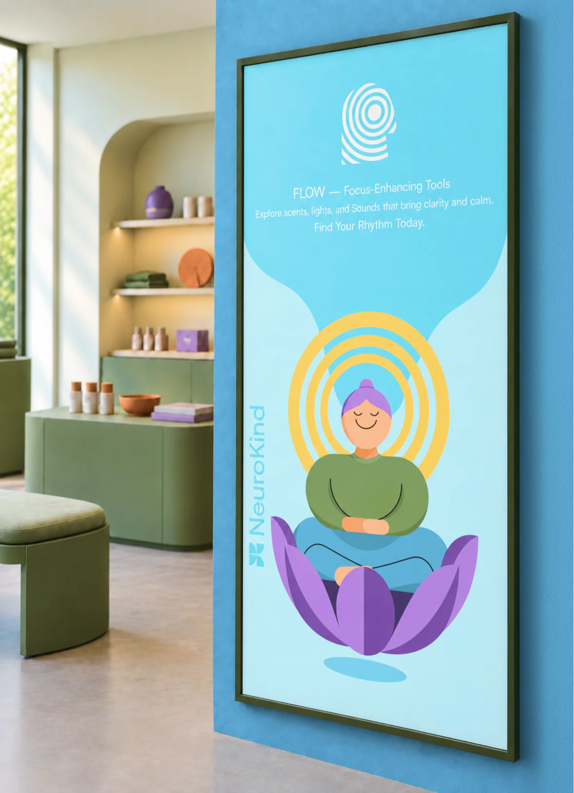
IN-STORE BANNERS
One banner per department, hung through the
store so visitors can find the right one.
Department icons
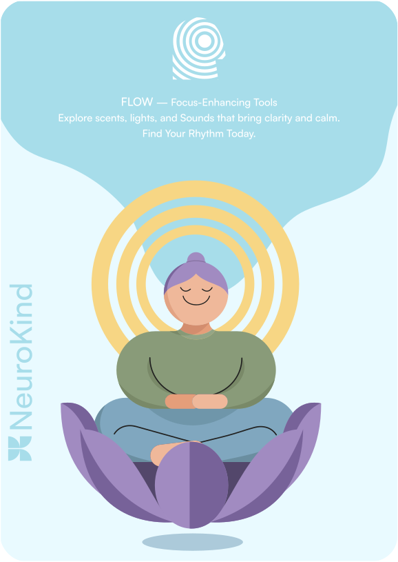
A serene space to help visitors find
their own rhythm of concentration.
SELLS
Lighting, scents, sounds, and things to hold.

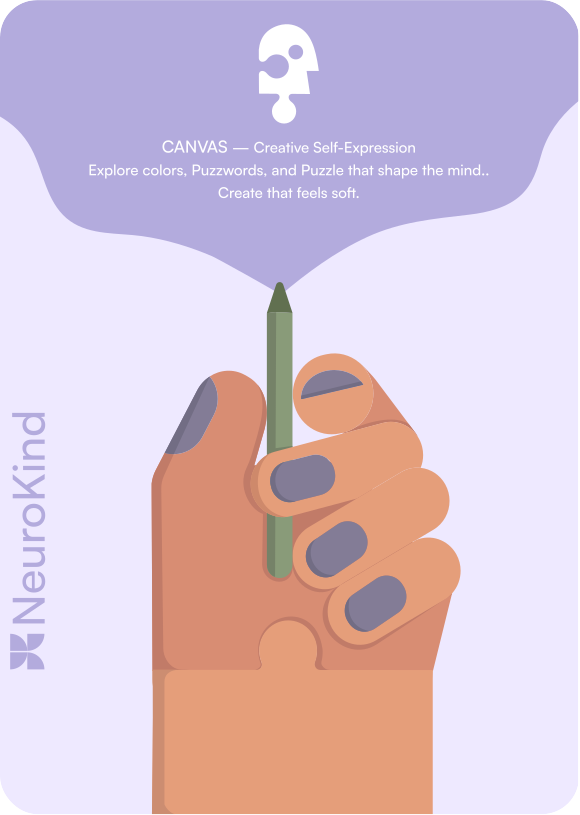
A soothing studio where creativity works
as a gentle form of reflection and release.
SELLS
Materials for painting, writing, and doodling.
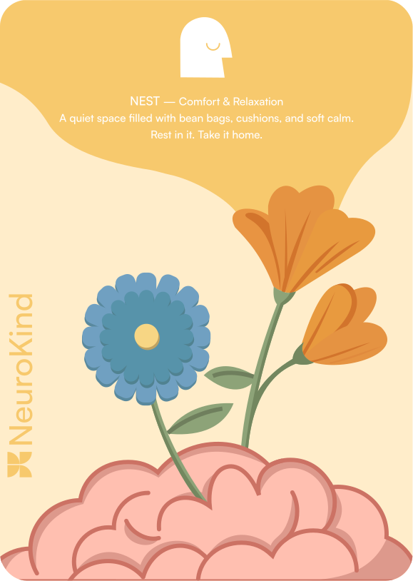
A quiet, softly lit retreat designed for
rest, comfort and taking calm home.
SELLS
Bean bags, cushions, and candles.

05 · IN STORE
From a lapel pin
to the shopfront.
The brand imagery represents calm,
creativity, and connection. Abstract
icons and patterns reflect harmony,
empathy, and renewal, with
geometric and wavy designs
symbolizing balance and flow. The
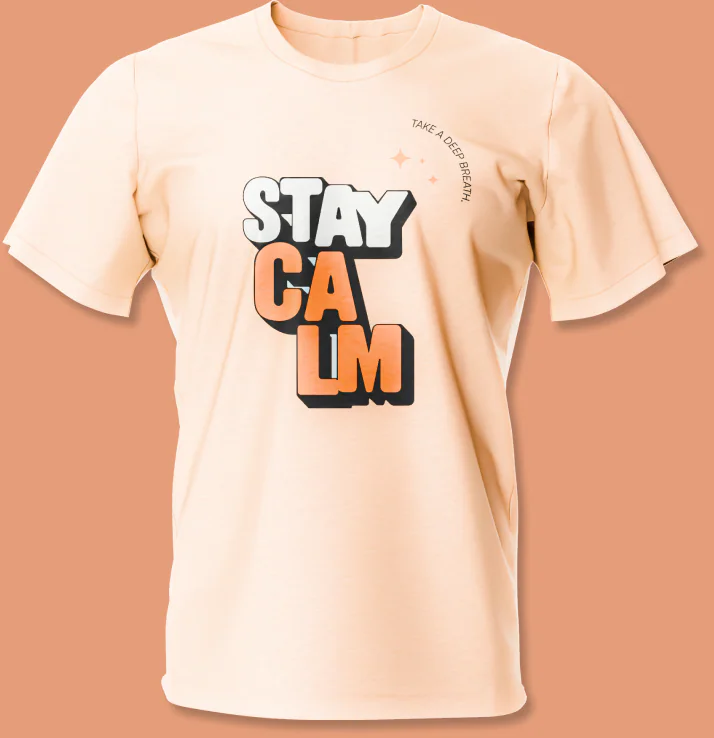
“Stay Calm” typography adds a
warm reminder of mindfulness and
emotional balance at the heart
of NeuroKind.
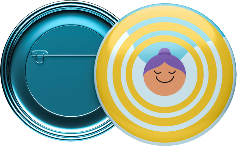
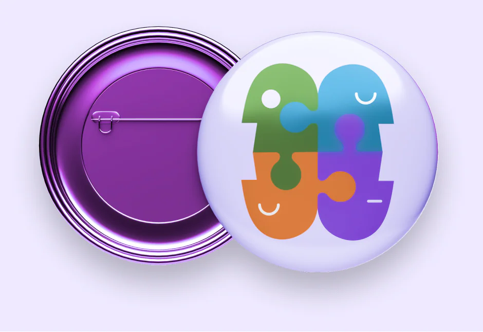
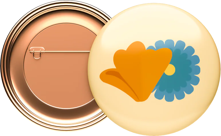
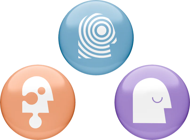
Department badge pins
These illustrated badge pins are used as
wearable identifiers for each department in
the NeuroKind store. The blue, orange, and
purple pins represent Flow, Canvas, and
Nest, helping visitors recognize each zone
while keeping a consistent and unified
brand identity.
T-shirt
This T-shirt is worn by visitors in the
NeuroKind store as a reminder to stay
mindful and balanced, reflecting the
brand’s calm and comforting atmosphere.
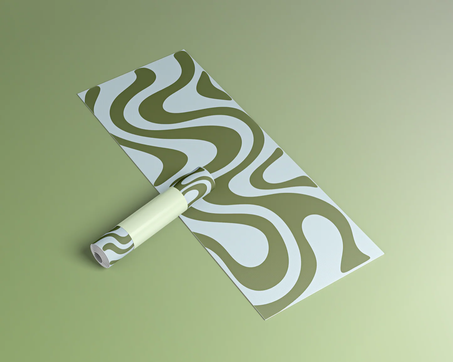
Yoga mat
This yoga mat in the Flow department lets
visitors sit, stretch, and relax while focusing
on calming sounds, gentle lighting, and
soothing scents.

Nothing in the store shouts.You can still tell where you are.
Next case study