





PRODUCT UX · SERVICE REDESIGN
The booking worked.
The trust didn't.
A self-initiated redesign of OutForm,
a Vancouver pottery studio, tracing
why people who could easily book
a class still wouldn't pay for one,
and what it took to change that.
AT A GLANCE
PROBLEM
The site could take a booking, but people left to
find proof before paying.
INSIGHT
The real blocker was trust, not the booking.
WHAT I DID
Rebuilt the structure so classes are easy to find,
and put proof where people decide.
OUTCOME
All three testers completed the booking
unaided; two would pay.
02 · THE PROBLEM
Two theories
about what was broken.Neither mentioned trust.
The brief and the studio owner each
blamed something mechanical.
Watching people use the live
site set both theories aside and
pointed to something quieter.
THE BRIEF SAID
Fix the booking system.
THE STUDIO OWNER SAID
It's not booking. People email us asking things
that are already on the site.
TEST PARTICIPANTS SAID
Neither. They booked a class easily,
without assistance.
PROBLEM STATEMENT
People could book a class on
OutForm's site. But it never
showed them where to start,
and it never earned their trust,
so they left to find proof
instead of committing.
03 · THE BREAKDOWN
Three places the
site lost people.
One tangle underneath.
WALL 1 · THE HOMEPAGE
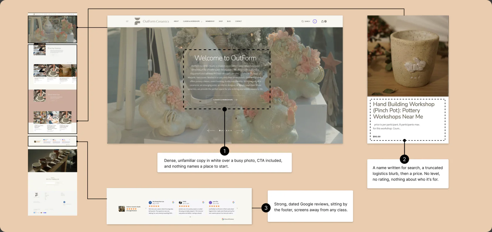
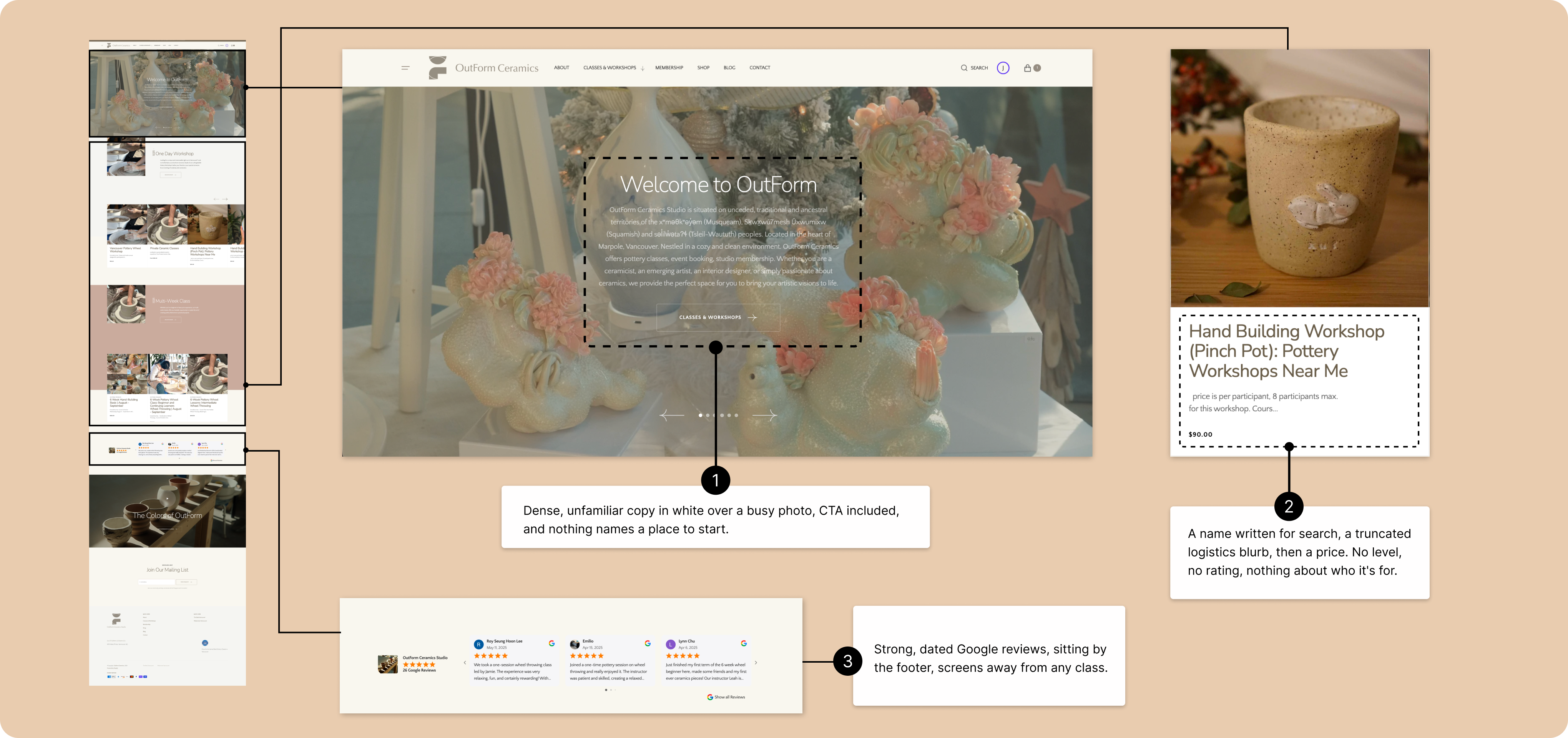
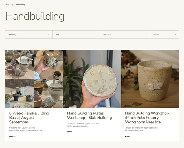
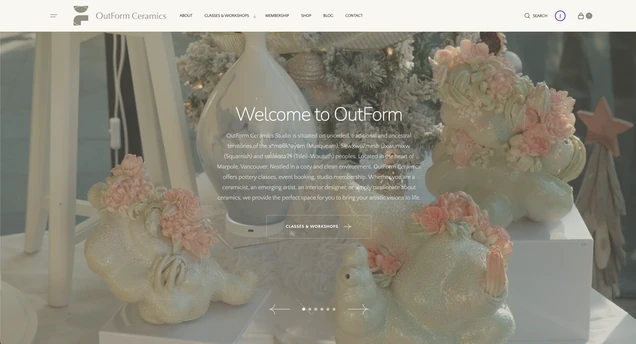
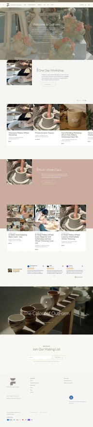
Nothing tells people where to start.
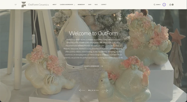
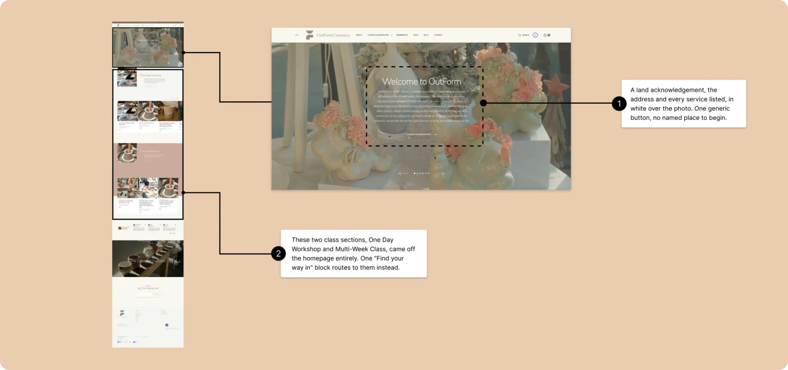
The homepage opens with dense, unfamiliar
language, while the class names read more like
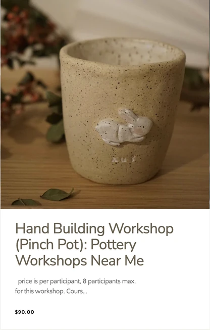
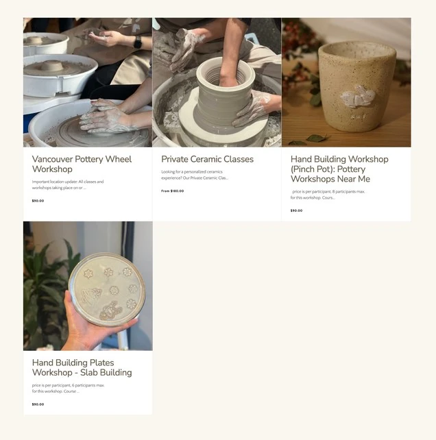
search terms than clear options; one real card is
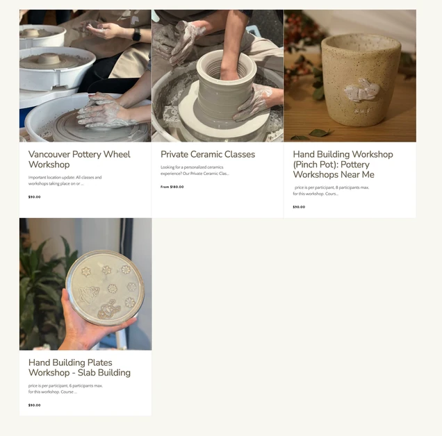
titled "Hand Building Workshop (Pinch Pot):
Pottery Workshops Near Me." The studio's
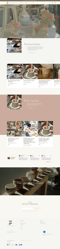
reviews are strong, but they sit near the bottom
of the page. People struggled to understand
what the studio offered and which path
was right for them.
"A lot of unfamiliar words on the first page."
 1
2
3

WALL 2 · CHOOSING A CLASS
The class names don't
orient a first-time visitor.
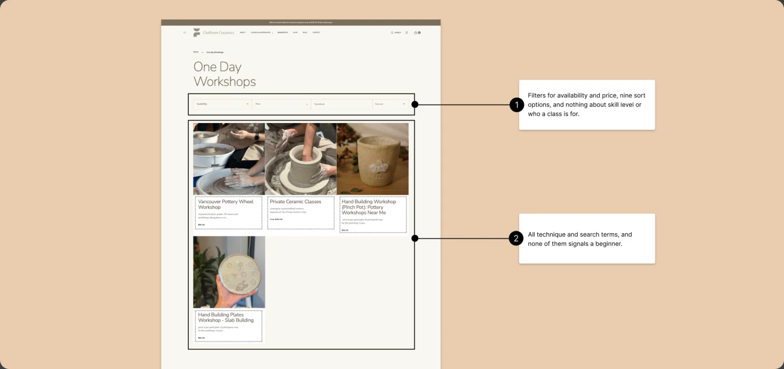
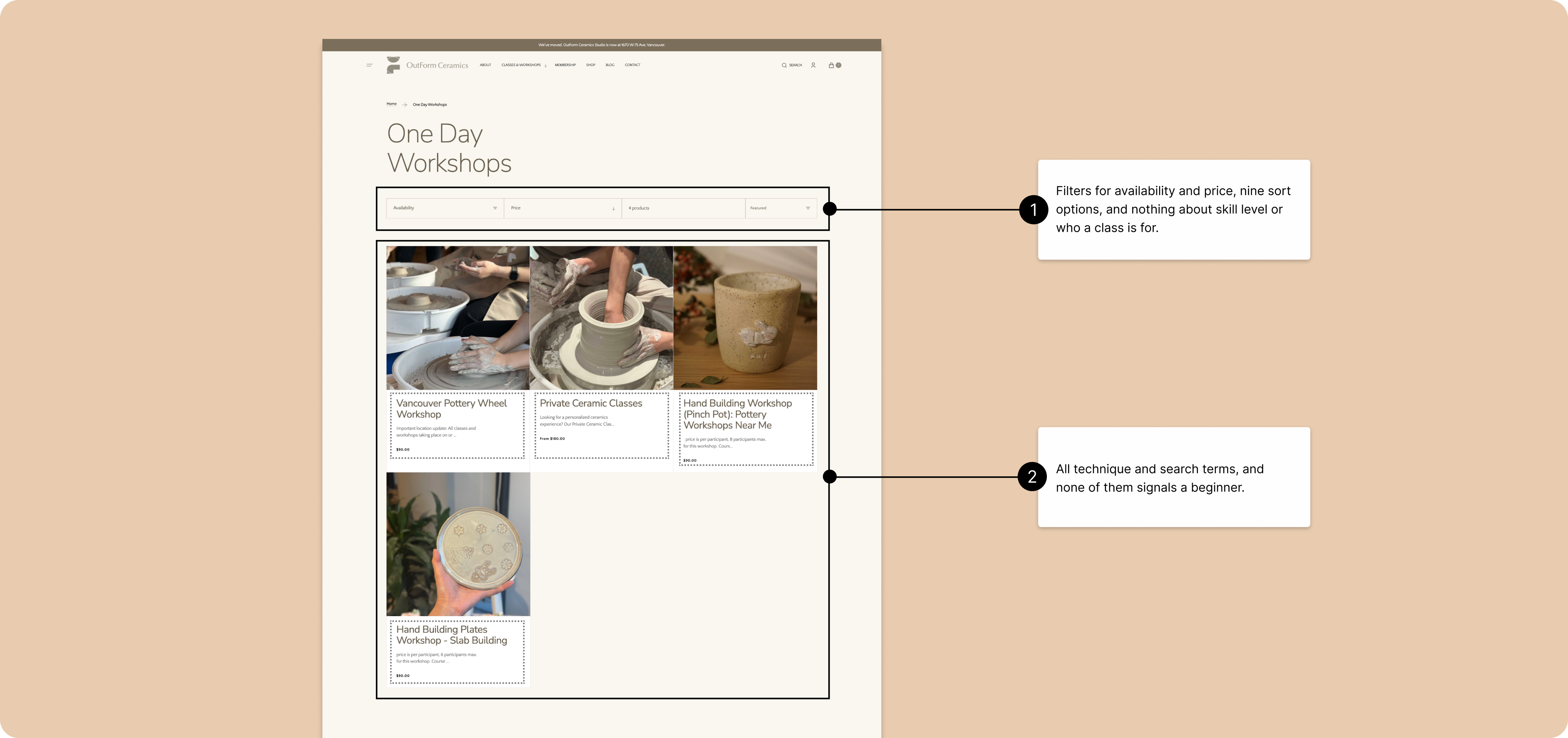
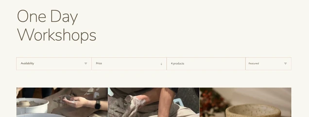
The listing filters by availability and price, but
not by level. The names do include a level, but it
sits buried in technique jargon, so it
never stands out.
"I don't really know the difference
between the hand-building class
and the pottery-wheel one."
WALL 3 · THE PRICE
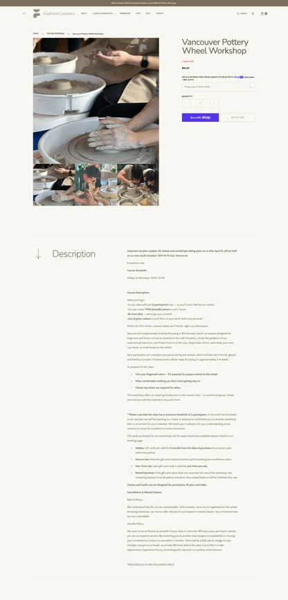
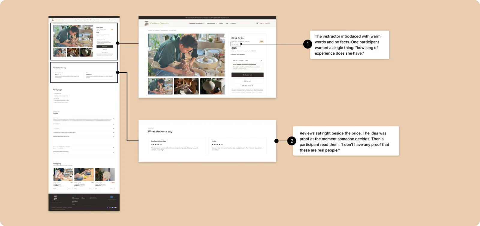
Nothing builds trust at the price.
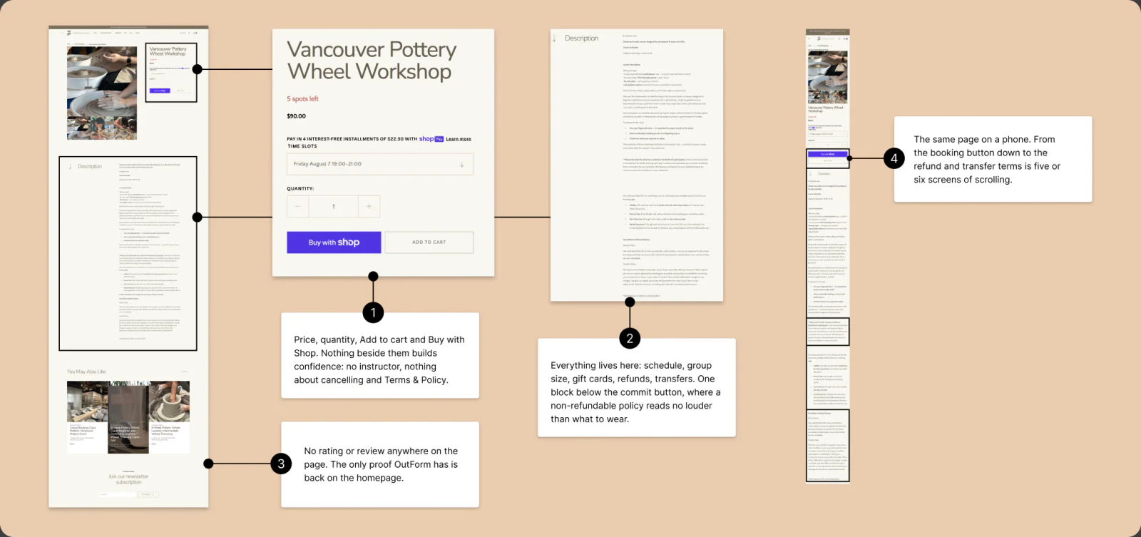
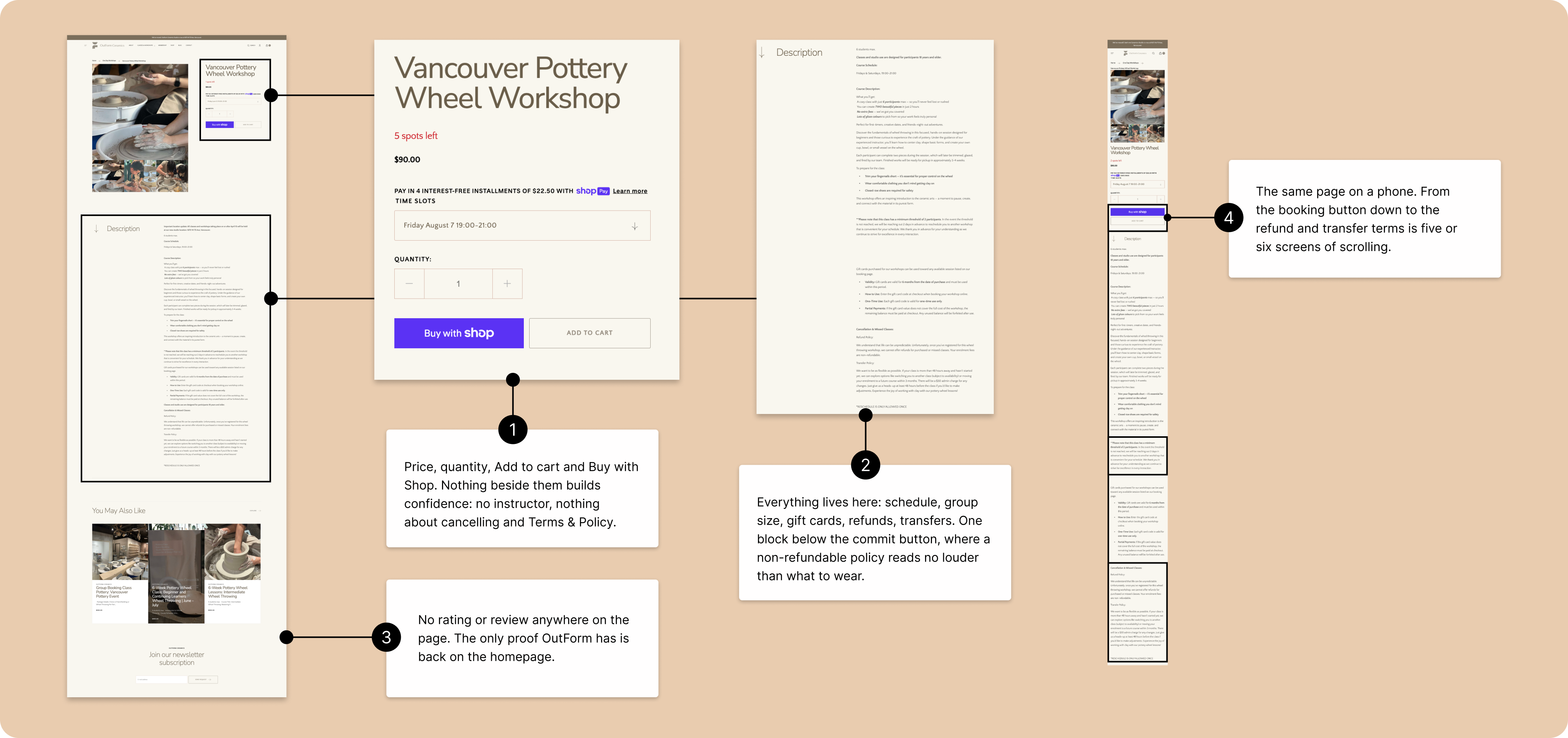
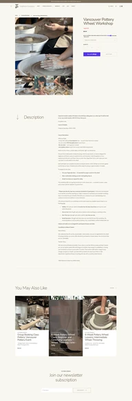
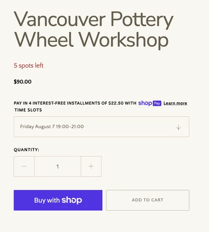
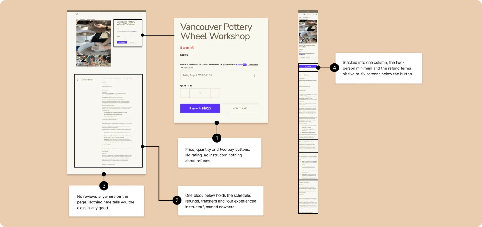
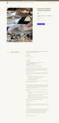
On the class details page people see the price
and the session options, but no reviews or any
other sign of credibility. With nothing to reassure
them at the decision, people leave the site to
look for reviews before paying. On a phone the
same gap widens: stacked into one column, the
binding terms land five or six screens below
the booking button.
"It's like going to a restaurant and checking
the Google reviews first."
 1
2
3
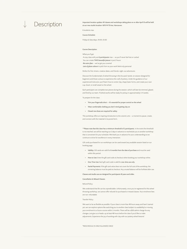
Terms & Policy.
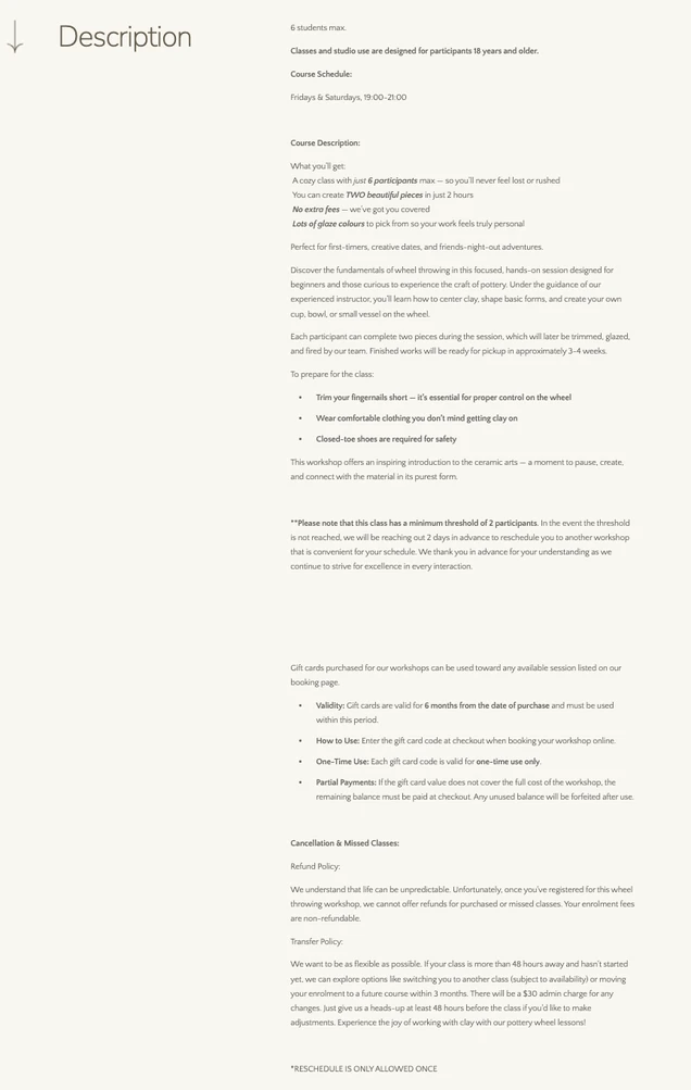
gift cards, refunds, transfers. One block
below the commit button, where a
non-refundable policy reads no louder
than what to wear.
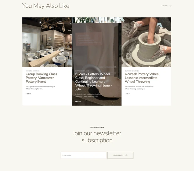
The only proof OutForm has is
back on the homepage.

UNDERNEATH THE WALLS · THE STRUCTURE
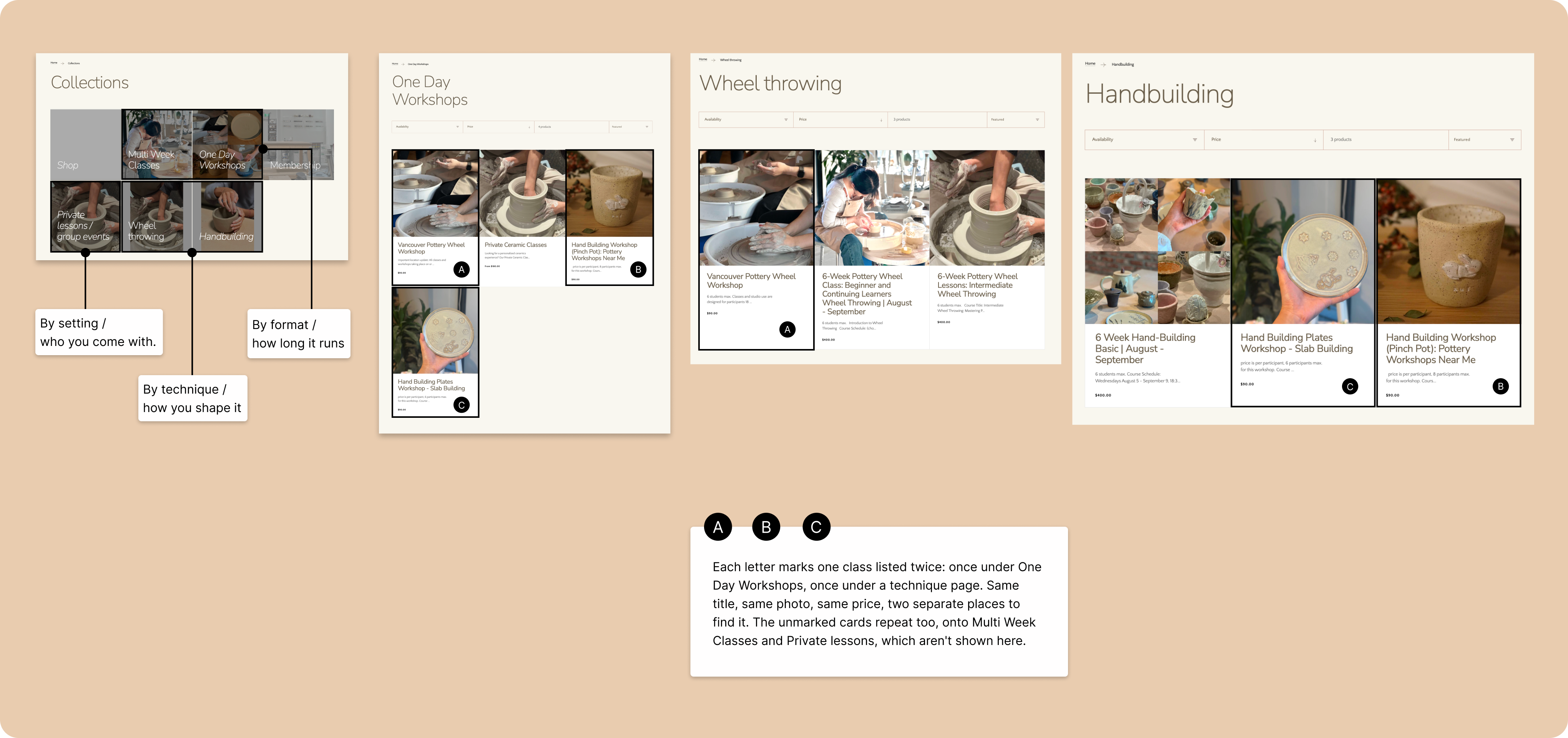
Underneath it all: one catalog, sorted
three ways at once.
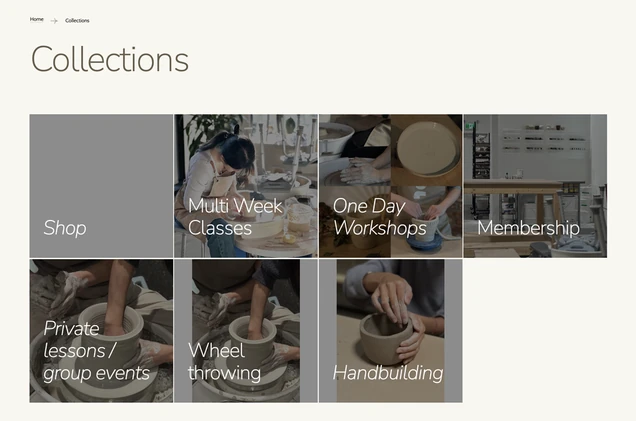
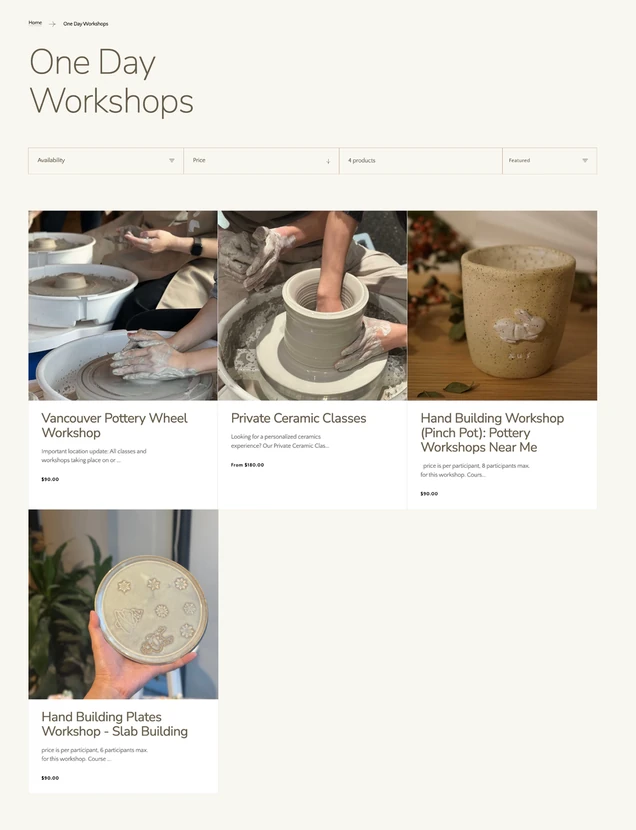
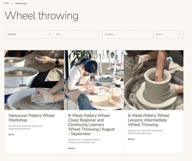
The way-in gap rested on a structural one. The
studio's 8 classes were listed 15 times, because
5 collections sorted the same catalog three
ways at once: by format, by technique, by
setting. A class fits more than one system, so 7
of the 8 sat on two pages, and the two
technique pages held nothing of their own. The
catalog read almost twice its real size, and there
was no single place to start.
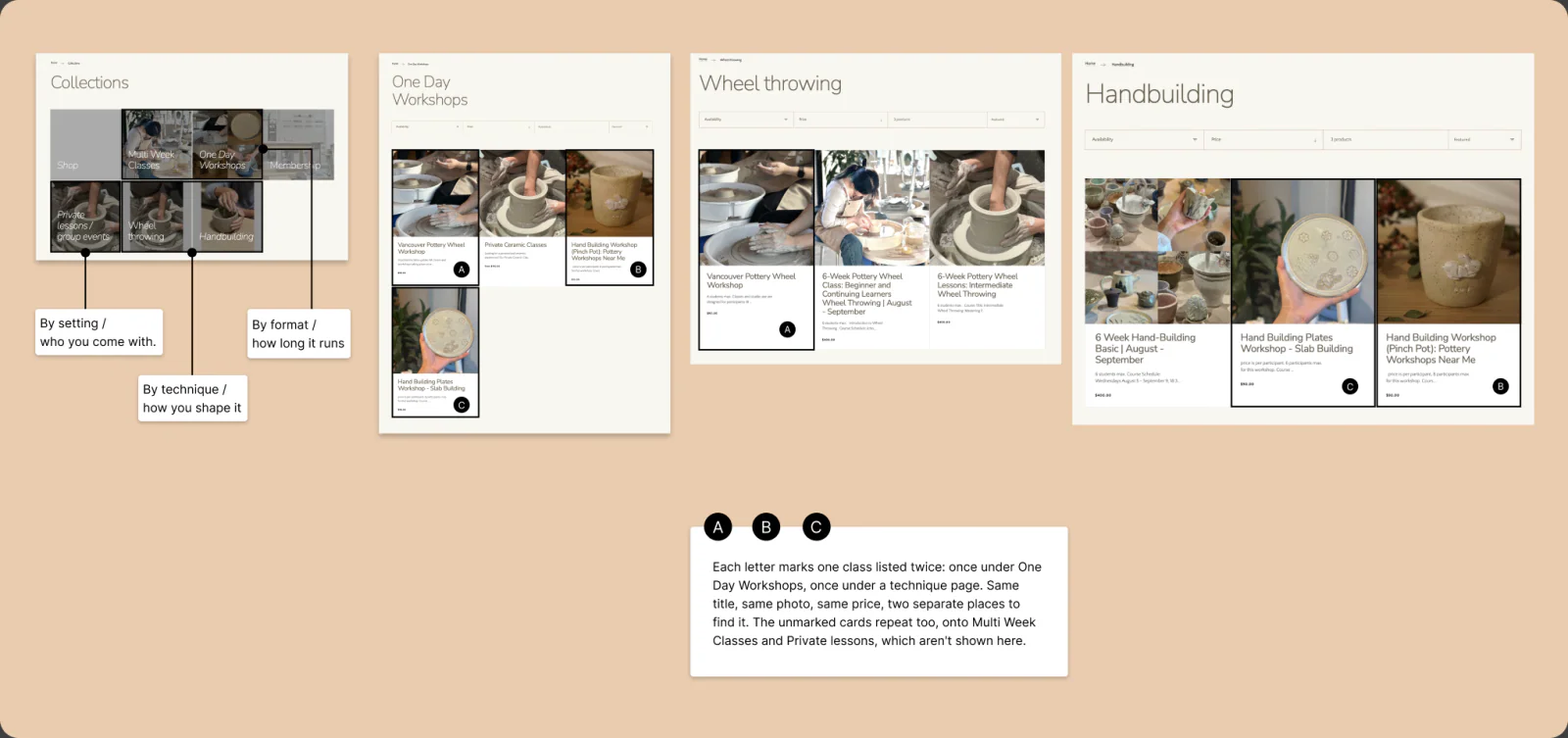
who you come with.
how long it runs
how you shape it
 A
B
C
 A
 C
B
04 · RESEARCH INSIGHTS
Two audits found faults.People had found
the reason.
The sessions reframed the project; 03 is what they showed. One caution: a usability test hands people the task, so booking on their own proved less than it looked. Two audits then shaped the build: a heuristic pass on the live site, and six competitors.
HEURISTIC EVALUATION · THE LIVE SITE
Real faults, all mechanical.
FOUND
A structured pass on the live site surfaced faults no participant ever raised: class pages running on a physical-product template, quantity stepper and "You May Also Like" row included, and theme content the studio never replaced, including a cart module reading "Popular Products Title" and a footer logo that spells the name "OutFrom."
WHY IT MATTERED
Each fault was small, but they landed exactly where people were judging credibility. Together they made the site read like an unfinished shop, and none of them explained why people who could book still wouldn't pay.
DESIGN IMPLICATION
Treat a class as a class, not a product, and clear everything that reads as neglect. The template had to change before any trust work could land on it.
COMPETITIVE AUDIT · SIX REFERENCES
Every local studio sells a class
like a mug. That was the opening.
FOUND
Six references audited: three Vancouver studios, and three from elsewhere that do it well. The locals all run a raw cart and strand their reviews on the homepage; only one of the six, the London marketplace Obby, puts proof at the buy button. The strongest references put the level in the class title, reviews above the booking button, and seat language in place of a cart.
WHY IT MATTERED
Booking a class anywhere locally feels like buying merchandise, and nobody earns trust at the decision. OutForm's gap was the whole market's gap, which made it an opening: the first studio to feel trustworthy at the buy button wins the nervous first-timer.
DESIGN IMPLICATION
Make enrolling feel like reserving a seat rather than buying stock, and put the proof where the decision happens. That became the redesign's biggest bet.
HOW MIGHT WE
It narrowed to two
questions, one per gap.
The site worked for people who already knew their class. It failed the ones still deciding, and the ones deciding whether to believe it.
How might we help someone feel sure which class is right for them?
Became the way-in move.
How might we help someone feel confident enough to book without leaving the site to check us out?
Became the trust move.
05 · THE SOLUTION
A clearer way in, proof
where people decide, and
one structure beneath both.
The two questions became
two moves, both standing
on one rebuilt structure.
MOVE 1 · THE WAY IN
Show anyone where to start, and
how to narrow to the right class.
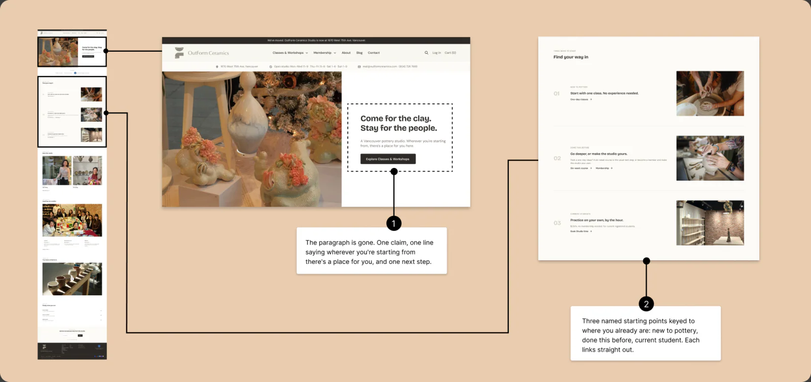
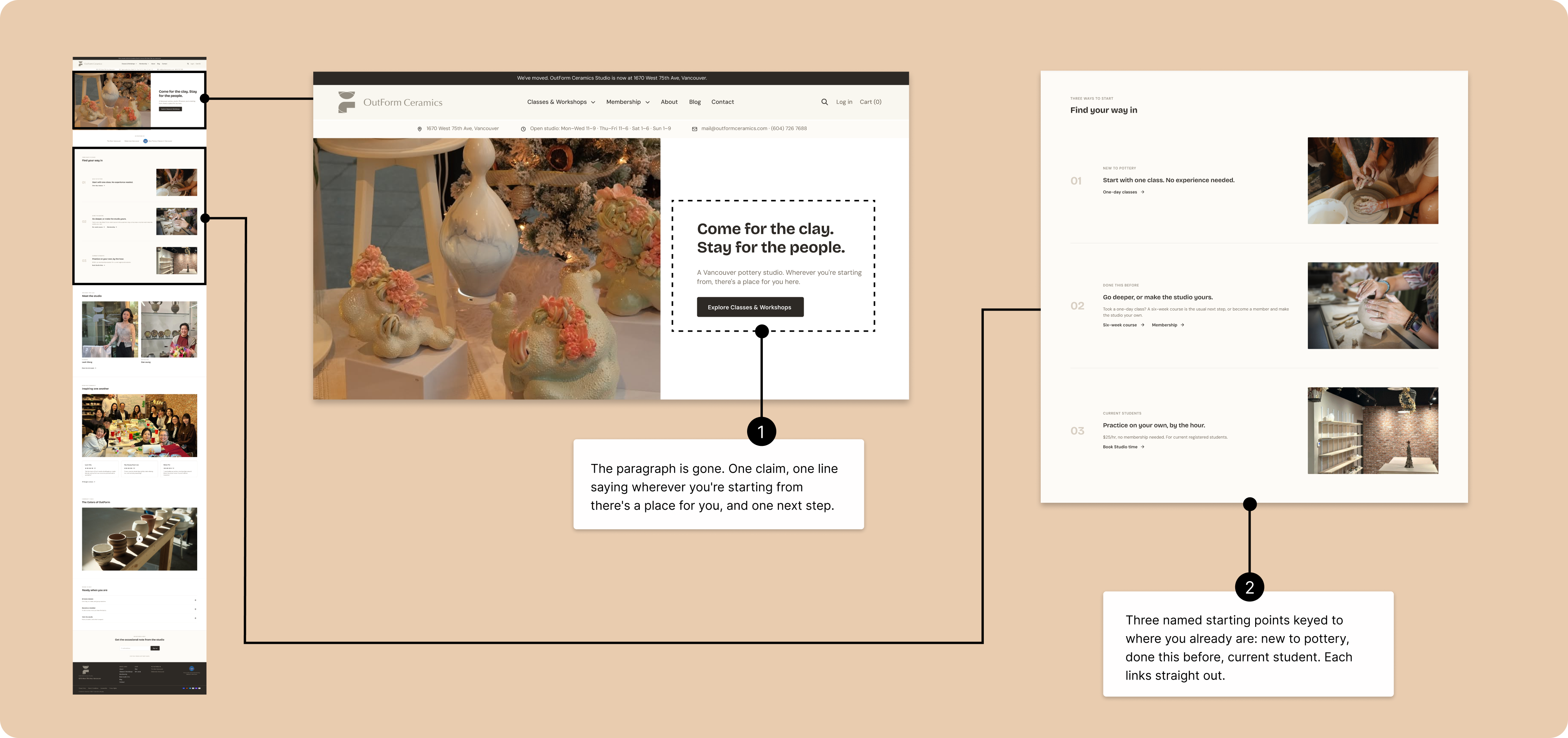
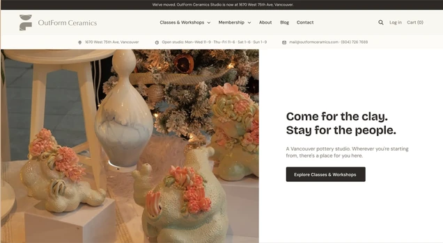
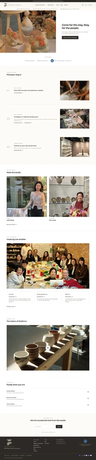
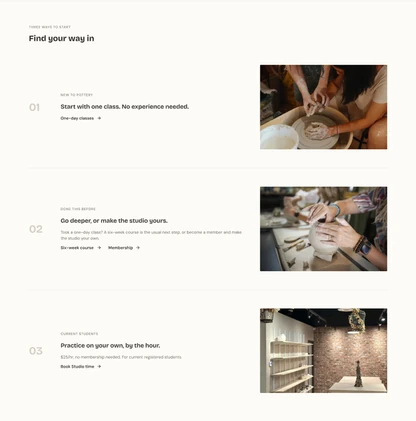
The homepage stopped listing classes and
started routing people. Instead of rows of
cards all weighted the same, it names three
starting points and sends each one straight
to the right page.
Homepage
 1
2
One Day Workshop and
Multi-Week Class, came
off the homepage
entirely. One "Find your
way in" block routes to
them instead.
 1
2
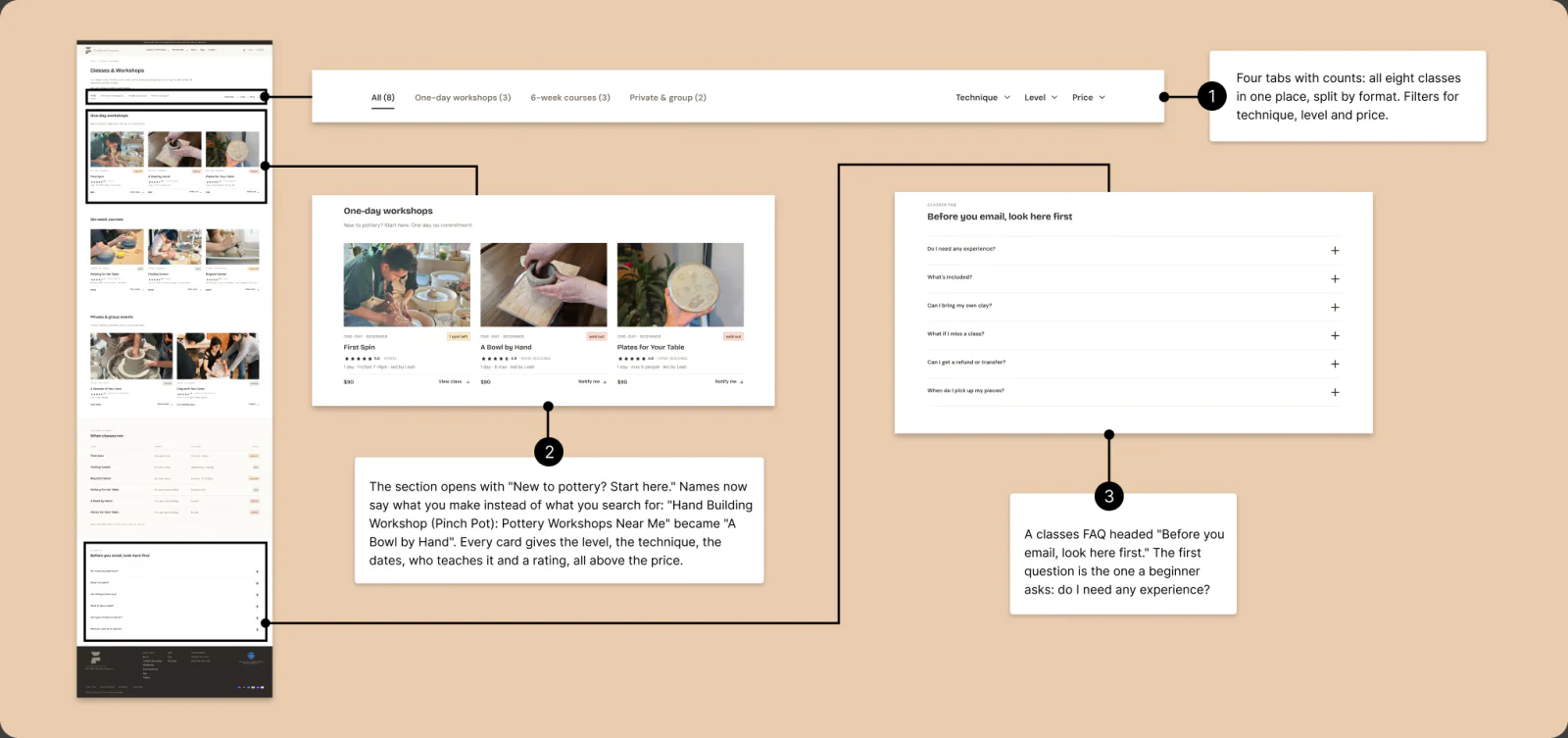
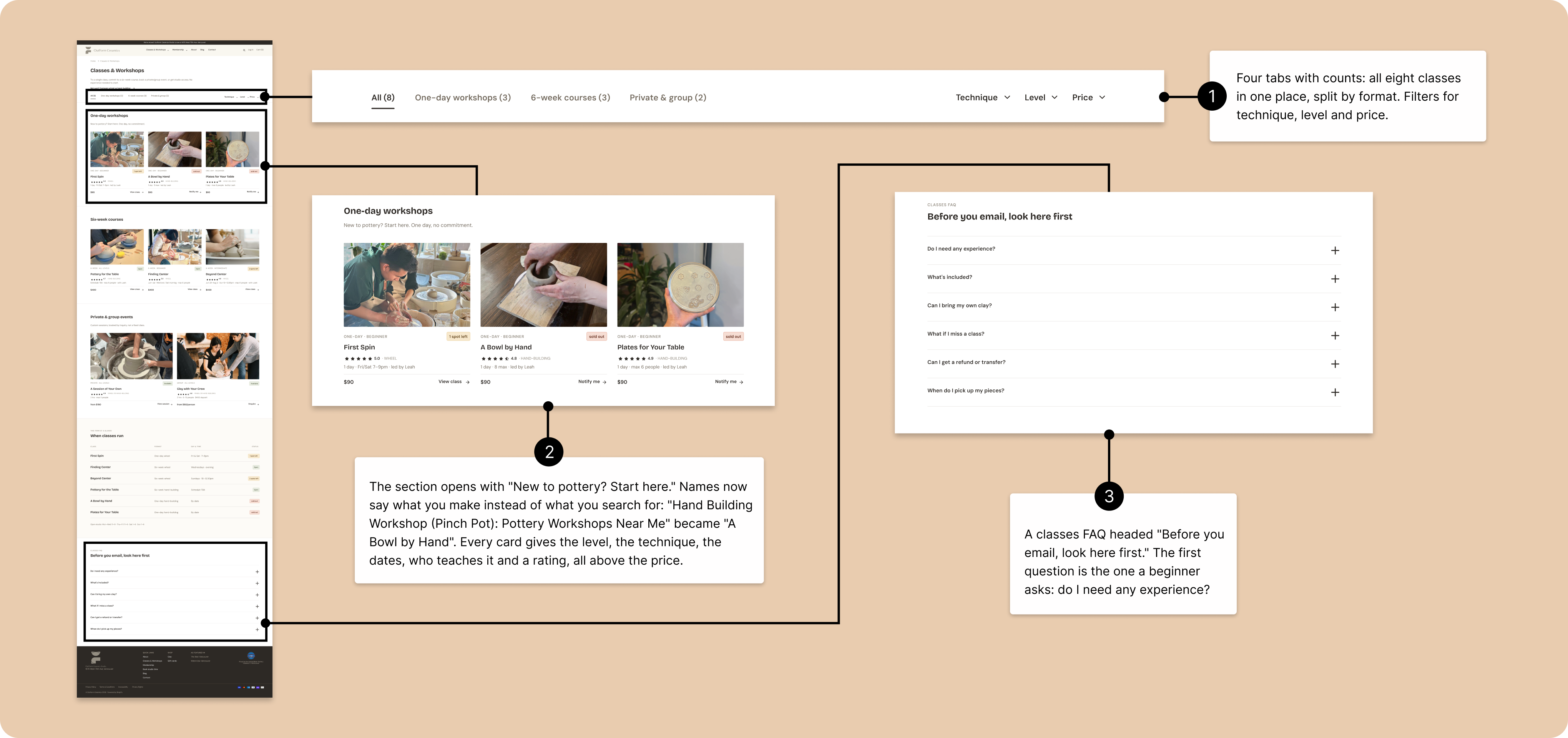
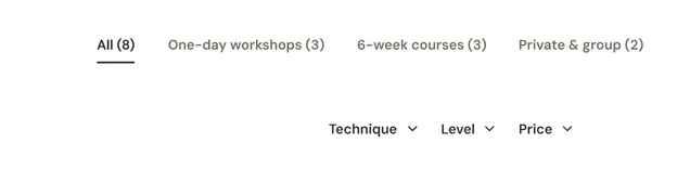
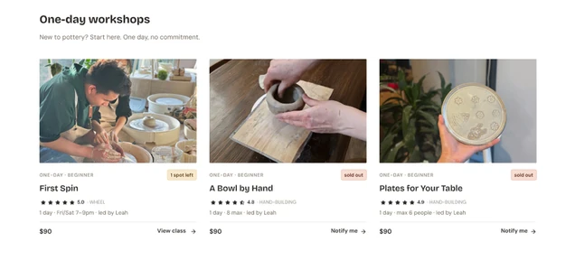
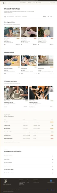
The browse page stopped sorting classes by
price and started sorting them by who they're
for. All eight now sit on one page split into
one-day, six-week and private, and a level
filter cuts that down to the classes that
match where you're starting from.
Classes & Workshops
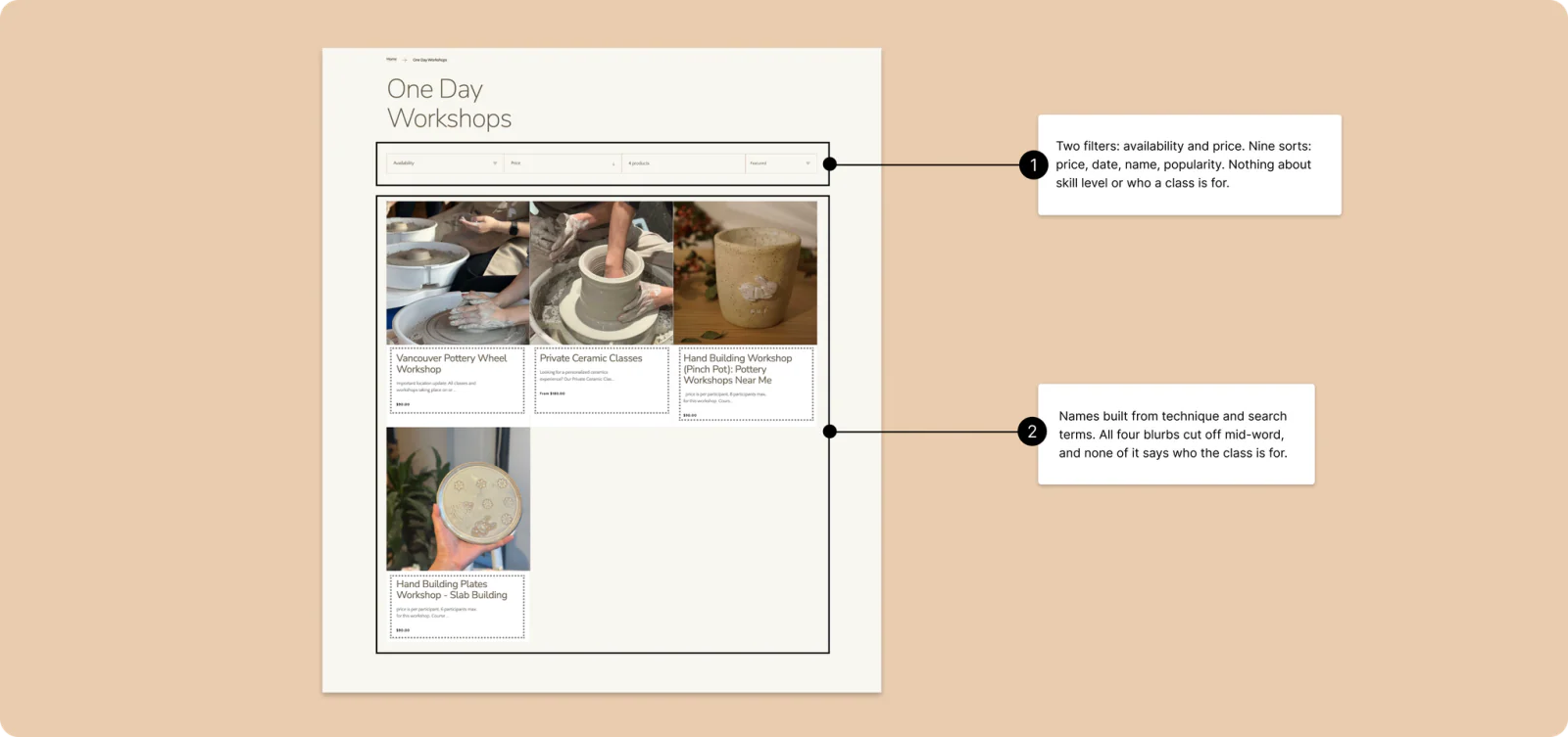
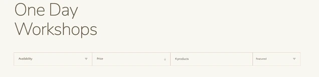
sorts: price, date, name, popularity.
Nothing about skill level or who
a class is for.
 1
2
3
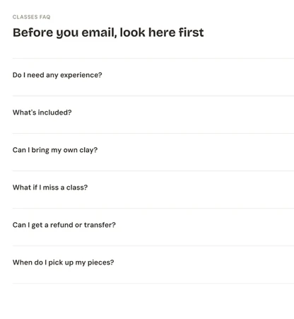
For the one choice names can't settle, wheel or
hand building, a short compare view helps a
newcomer decide.
MOVE 2 · PROOF AT THE DECISION
Put the proof on the page people
were leaving to find.
The first build brought the proof and the fine
print onto the page, right at the decision.
Testing then changed whose proof it should be;
that is in 06.
Class details
 1
2
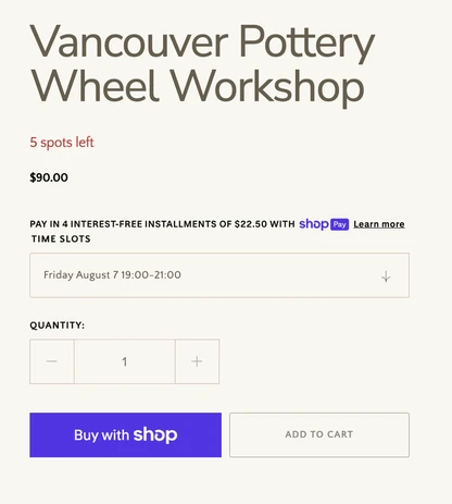
buy buttons. No rating,
no instructor, nothing
about refunds.

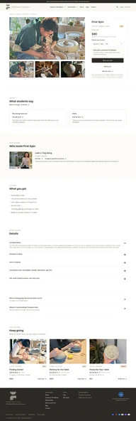 1
2
3
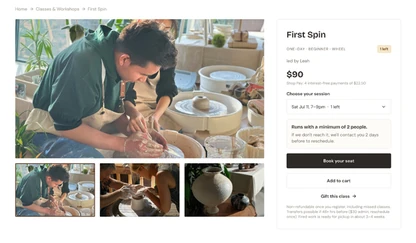
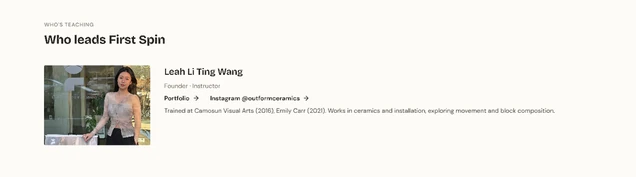
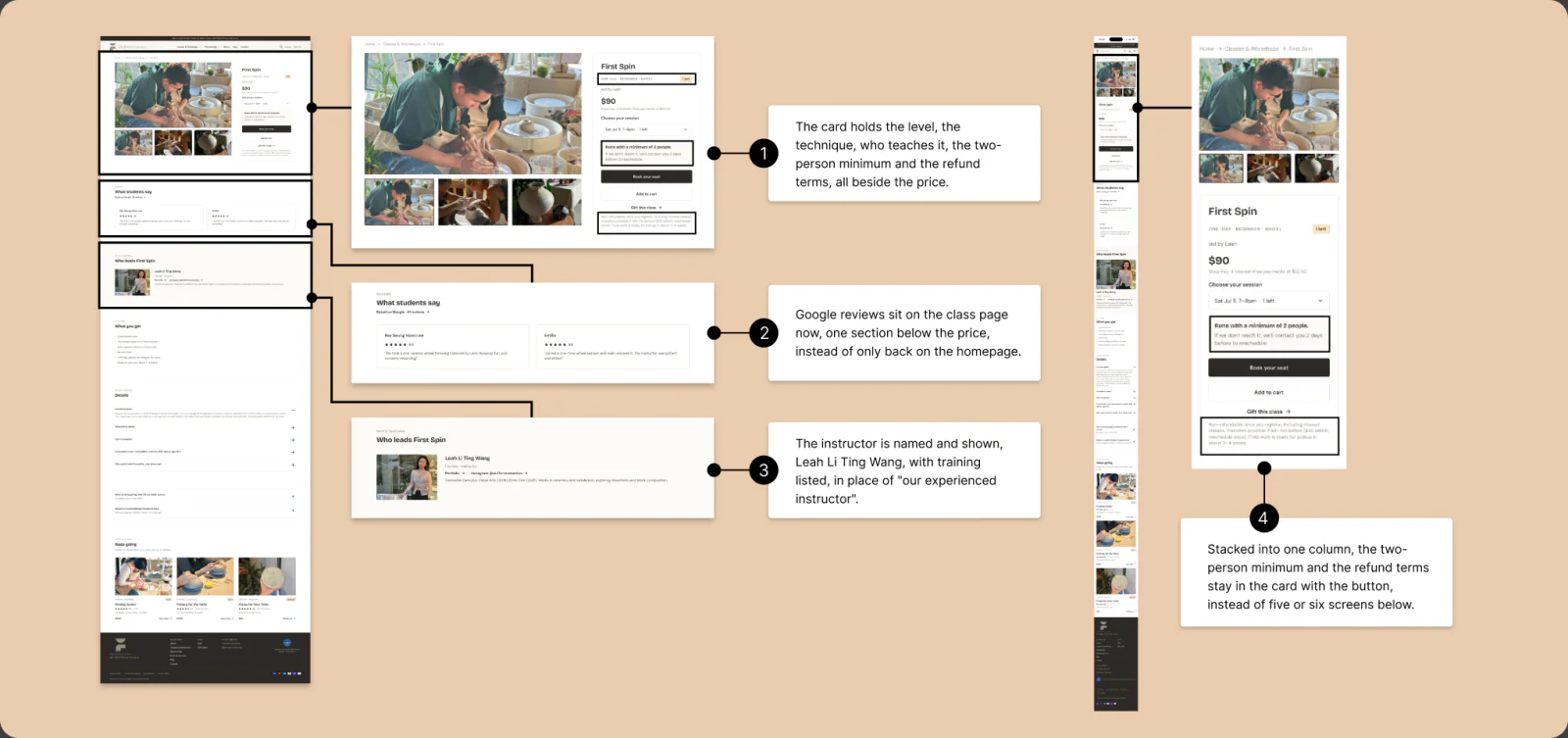
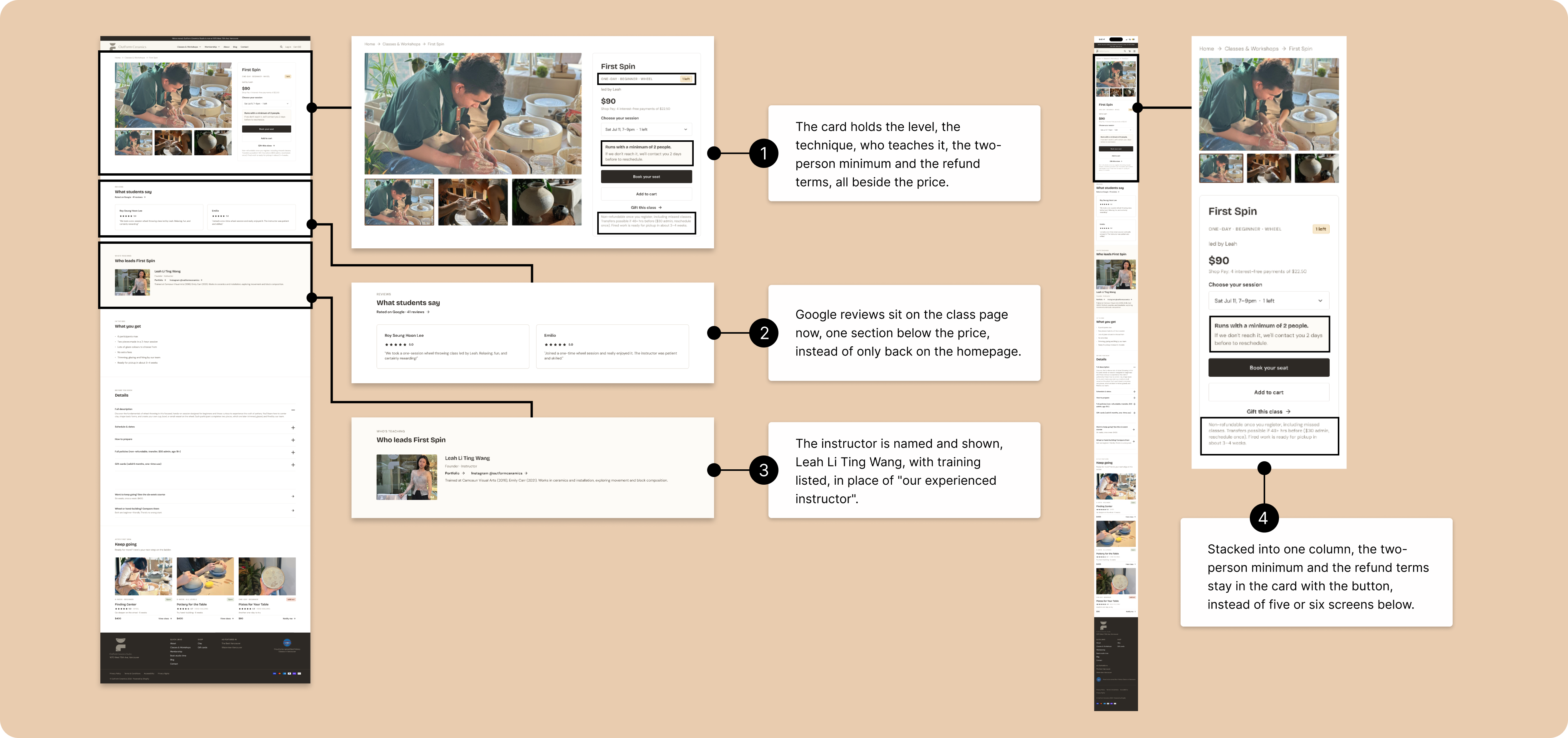
shown, Leah Li Ting Wang, with
training listed, in place of
"our experienced instructor".

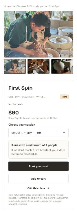
two-person minimum and the
refund terms stay in the card
with the button, instead of five
or six screens below.
The studio's own reviews moved onto the
page; testing overturned this in 06.What's included and the terms show before
the commit, not after.The instructor is named and
shown, so the class has a face.
THE FOUNDATION · WHAT THE WAY IN STANDS ON
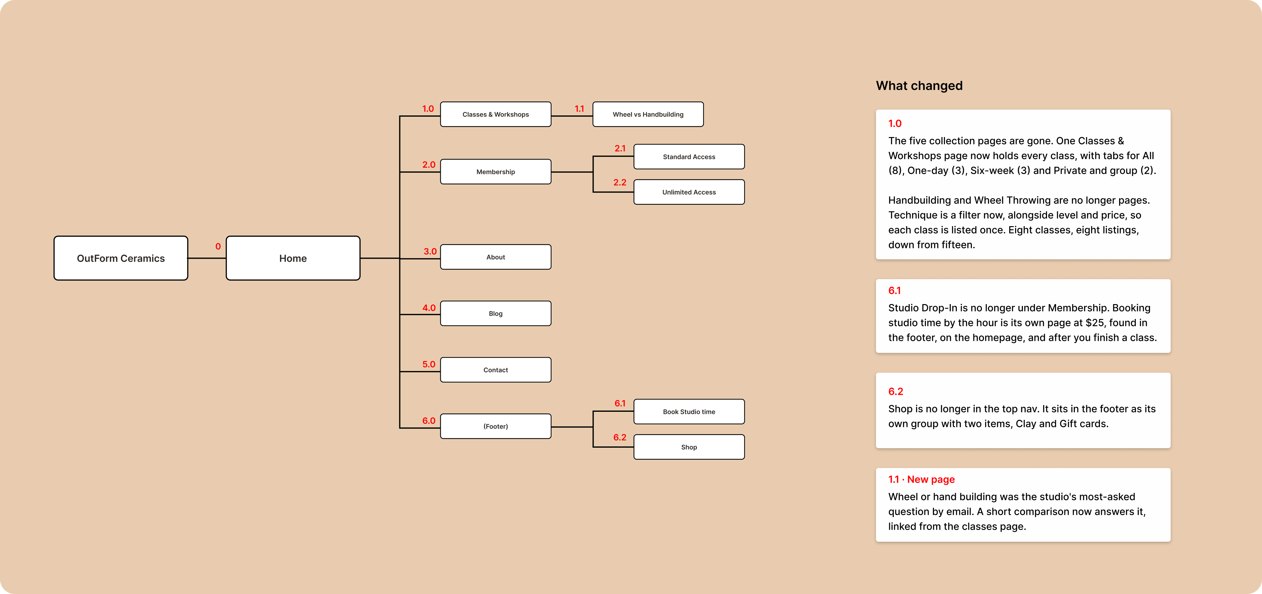
Fifteen listings became
eight classes.
Eight classes were listed fifteen times, across
five collections sorted three different ways at
once. Folding those into one catalog is what the
browse page rests on: one page to filter, instead
of five to dig through.
Site structure
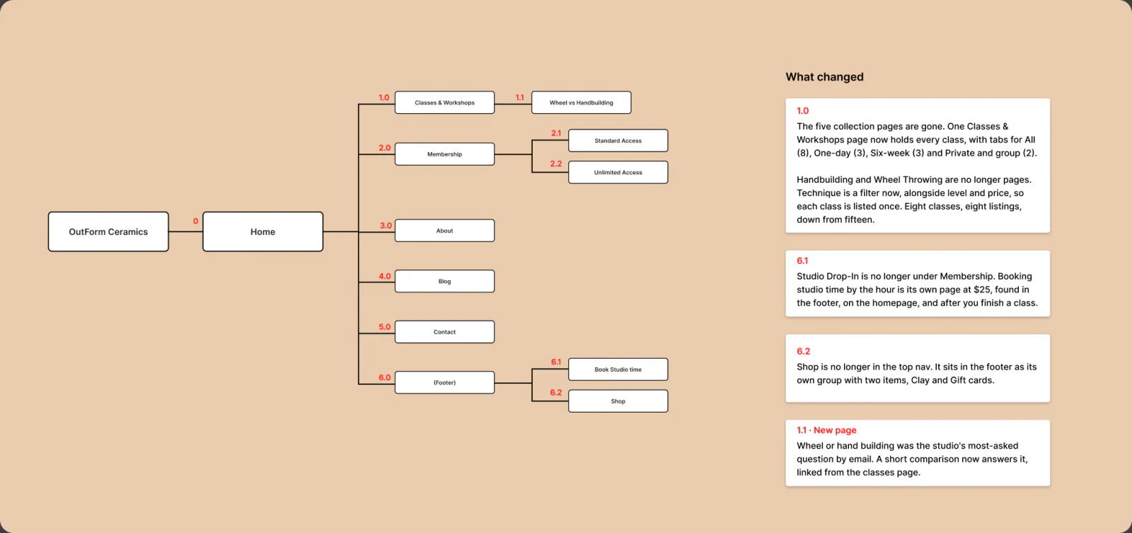
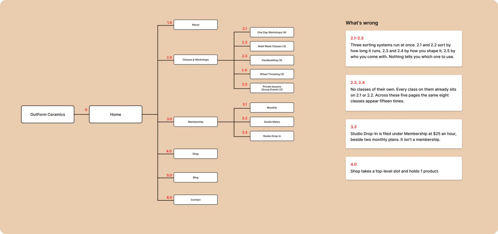
Throwing (3)
/Group Events (2)
and holds 1 product.
Handbuilding and Wheel Throwing are no longer pages. Technique is a filter now, alongside level and price, so each class is listed once. Eight classes, eight listings, down from fifteen.
Walk the redesign end to end.
Every screen you just saw, connected as one
interactive prototype.
OUT OF SCOPE
Shopify hosts the checkout, so it
cannot be redesigned without
upgrading the platform. The checkout
and confirmation screens here exist
so the flow can be walked end to end,
not as work that could ship.
06 · TESTING & OUTCOME
Testing overturned the
redesign's biggest bet.
Three people walked the
redesign, with the live site as
the baseline. Enough to overturn
what expert review had endorsed.
WHAT TESTING CHANGED
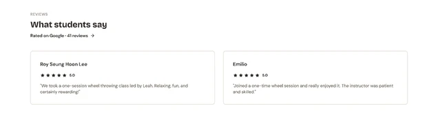
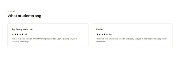
Real people trusted Google, not the
studio's own reviews.
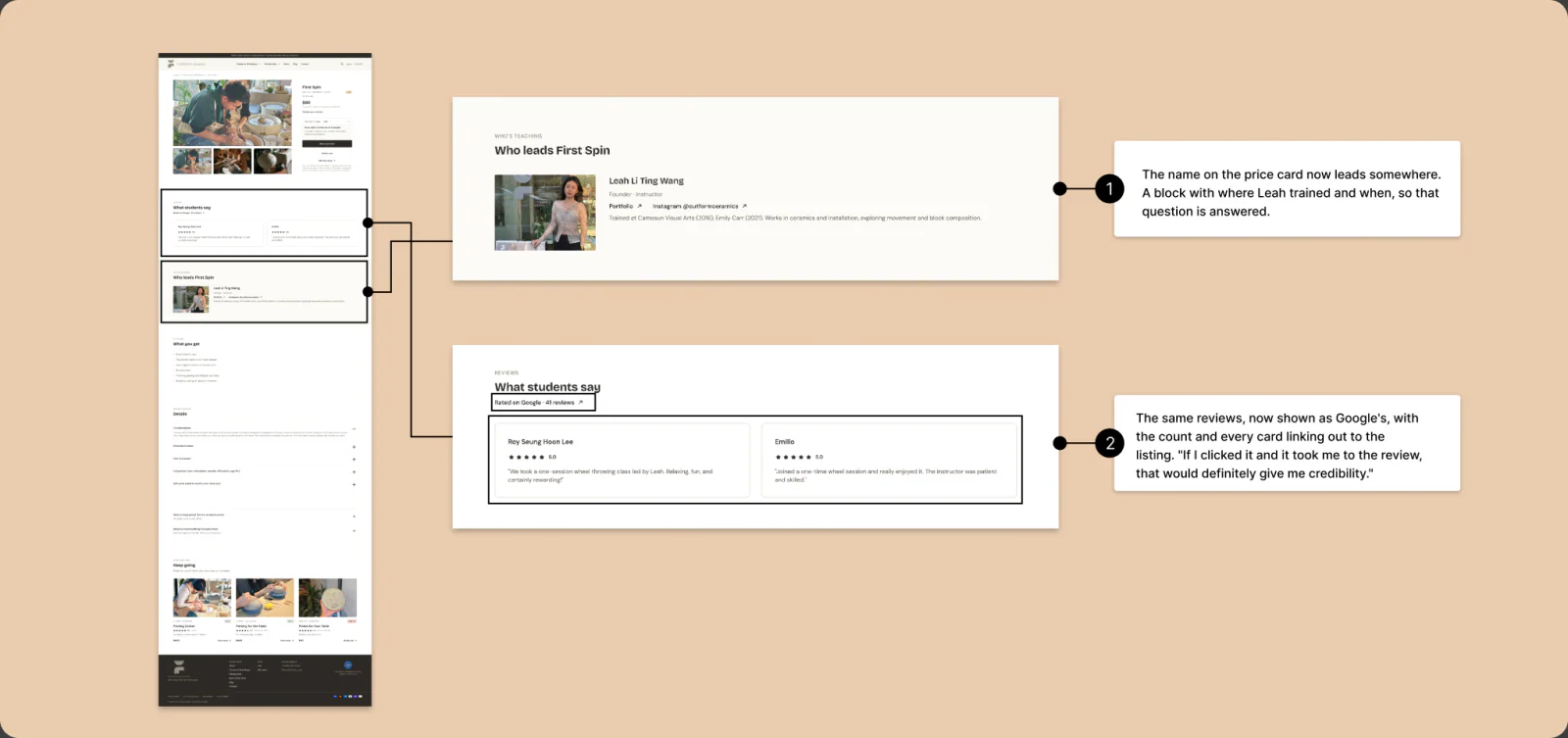
The first build moved the studio's own reviews
onto the class page, right after the price. That is
what both audits had recommended. Every
participant rejected it: they wanted proof they
could check for themselves, not proof the studio
published about itself. Rebuilding for that is
what changed the class page.
THE CLASS DETAIL PAGE
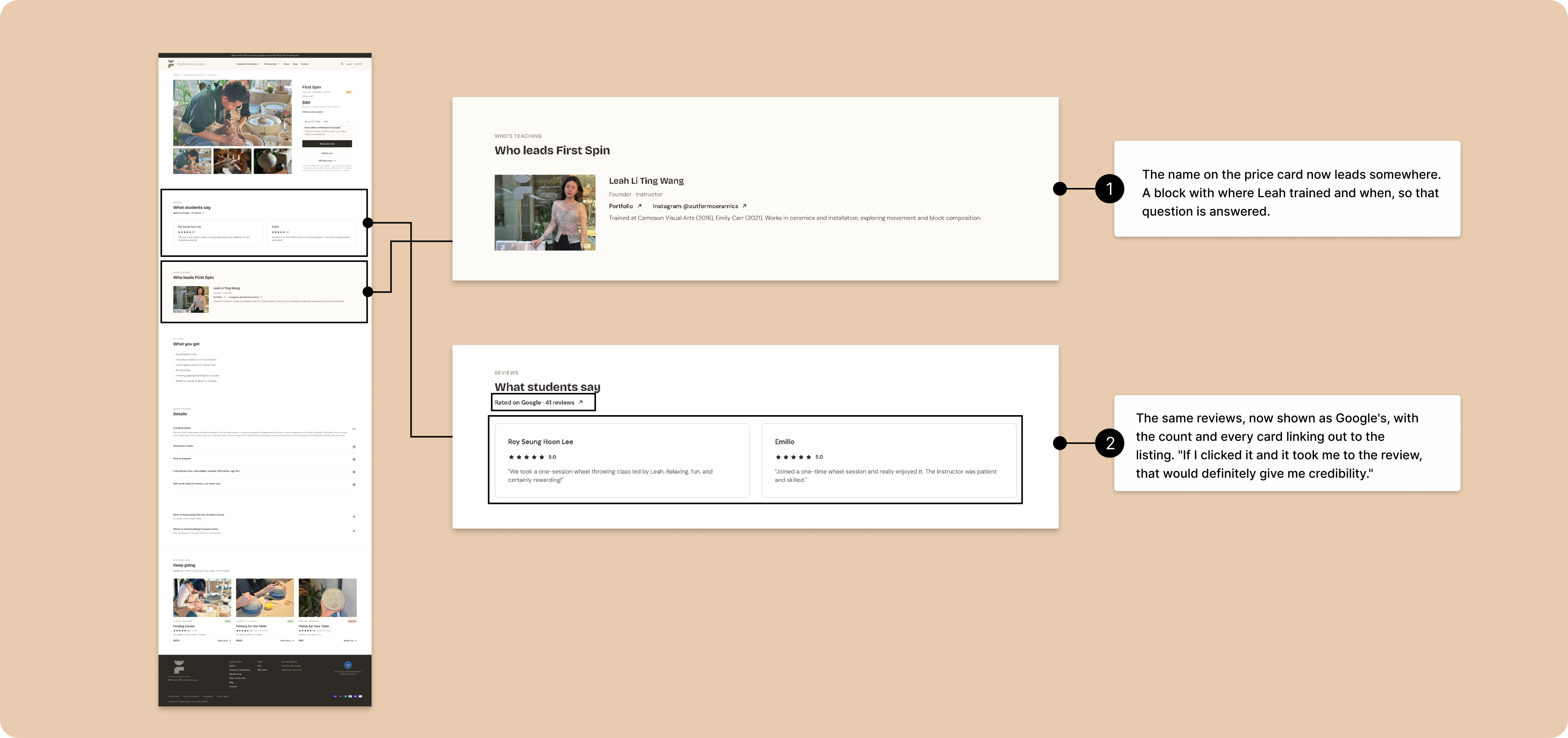
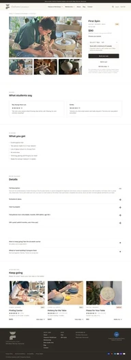
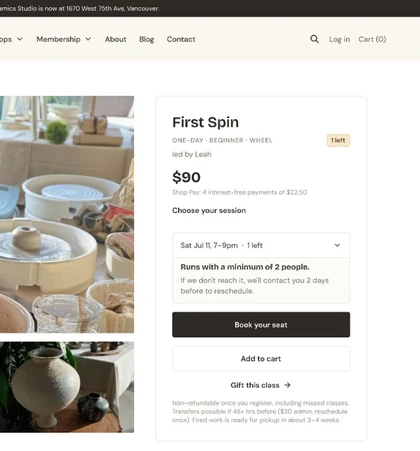
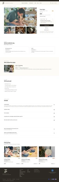
The class page gains the proof and
clarity people were leaving to find.
 1
2
real people."
 2
1
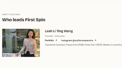
card now leads
somewhere. A block with
where Leah trained and
when, so that question
is answered.
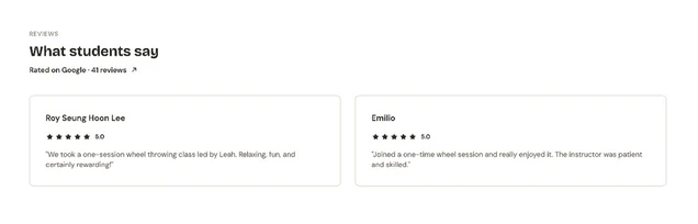
give me credibility."
Reviews link out to the real Google listing, so
the proof is verifiable.The instructor shows real
credentials, not adjectives.
THE RESULT
Two of three would pay. The third
wasn't a design problem.
Two rounds, different people: two on the live
site, three on the redesign. Same tasks, same
questions. Booking held. Paying moved.
| MEASURE | LIVE SITE | REDESIGN | WHAT MOVED IT |
|---|---|---|---|
| Would pay today | 0 of 2 | 2 of 3 | Proof at the decision, after testing swapped the studio's own reviews for Google's. |
| Confidence to pay,out of 10 | 6 | 8, 8 to 9, 9 | Terms and what's included shown before the commit; the instructor named with real credentials. |
| Booked without help | 2 of 2 | 3 of 3 | Nothing. Booking was never broken, and folding 15 listings into 8 classes did not break it. |
THE THIRD NO
One person still wouldn't pay. The reason was
the price of a class, not anything on the screen.
Design cleared the blockers it caused. That one
it didn't cause.
WHAT THIS PROVES, AND WHAT IT DOESN'T
Five people across two rounds, stated intent,
never shipped. Enough to overturn a bet the
audits had endorsed, not enough to claim a
conversion lift. If it shipped, the measure is the
owner's inbox: fewer emails asking what the
site already says.
07 · REFLECTION
Whose proof, how few
people is enough, and
where design's job ends.
Three lessons I am taking past this
project, less about pottery than
about how I will test the next thing.
TAKEAWAY 01
My research told me where to put
proof. Real people told me whose.
The strongest signal in my research said to
move the studio's own reviews to the moment
people pay, the way almost no competitor did.
All three testers overturned it: they wanted
proof they could check for themselves, on
Google. I had the placement right and the
source wrong. Next time, whose proof gets
tested before it gets built.
TAKEAWAY 02
A small sample, owned
honestly, is still evidence.
Testing closed at three people, and the page
says so plainly instead of dressing the number
up. But three real people, all pointing the same
way as the studio's own inbox, were enough to
overturn my best-supported bet. And re-testing
the same three after one change is what turned
one yes into two.
TAKEAWAY 03
Know where design's job ends.
Every blocker the tests found fell into one of
two piles: things the interface caused, and
things it didn't. Design cleared the first. What
was left was one person weighing the price of a
large class, which no screen controls. That no
was never mine to design away, and knowing it
is what let me call this done.
The booking worked.Now, for two of three,
the trust does too.